Logo Creation Method - Repetitive Basic Shape Design (2)
2 Repeated basic features
1) Strive for simplicity
Easy identification is a major principle of logo design, which determines the special requirements for logo design to be concise. The so-called "Jane" means to be concise and eye-catching; the so-called "clean" is to be clear and concise. Concision is not simple. Conciseness as an art rule organizes complex meanings and diversified forms into a unified structure. It organizes complex materials into ordered wholes with as few structural features as possible. It means quantity. Reduced, qualitative increase. For example, triangles are simpler than squares, but their properties are more complicated. The concise image has a strong visual impact. It creates a clear, powerful, fixed and unified image in people's minds and is easy to identify. The basic form of repetition is itself an iterative arrangement of basic forms. To obtain good visual effects, it is necessary to repeatedly scrutinize the design and arrangement of the basic forms to obtain the most abundant visual effects with the most concise graphics.
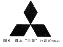
Japan's "Mitsubishi" company's logo is very impressive. The “Mitsubishi†symbol (Fig. 6) is a basic shape with a positive rhombus as the symbol. It is centered on the apex angle of 60° in the rhombus and rotates at an angle of 120° to form a pattern that is entirely contained within a large triangle. It is concise and easy to remember. As long as people see the combination of these three diamonds, they naturally think of Mitsubishi.
2) Compact structure
Logo design is the art between square and inch. It creates complete and beautiful graphics in a limited plane, while at the same time it is easy to identify, unique, and accurately convey the internal information content of a company or institution. This requires the designer to fully consider the comprehensive factors of the logo when designing, balance and compare the composition, eliminate the complexity, and avoid the irregular combination and arrangement, resulting in the cumbersome and cumbersome logo design. The compact design can create a full, complete visual effect, giving a competent, rigorous impression. Marks based on repeated basic shapes often use simple basic shapes. In the arrangement of basic shapes, a center point forms a visual center of gravity, and a compact structure is used to convey the image and content of the mark.
The Italian Edison logo has undergone a redesign process along with the company's reforms. Compared with the old sign, the new sign (Fig. 7) is centered on Montedision, and the four overlapping arrows on the periphery symbolize four departments, expressing the idea of ​​flying as a whole. Among the four arrows, the middle position just forms a blank arrow shape. The interesting arrangement of repeating basic shapes forms the arrow. The black and white contrast makes this white arrow a visual center, adding fun to the design and Visibility. The overall design of the logo is rigorous, and it accurately expresses the professionalism of all departments of the company to work together and work together to establish a good corporate image for the company.
3) Pay attention to balance
Balance gives people a steady, pragmatic psychological feeling. The sense of balance is the inescapable feeling of human physiology. Our visual habits give us a sense of balance brought by symmetry. For example, the physical structure of a person, from the distribution of facial features to the trunk and limbs, is symmetrical. The growth structures of other animals, such as butterflies and goldfish, are also mostly symmetrical. The symmetrical form can achieve a balance of power on the function and make people feel completely intact. In the design of repeated basic shapes, there are many examples of breaking the symmetry balance. This is due to the fact that symmetry is too complete and lacks change. Human vision does not satisfy a completely rigid form, and requires development, progress, and change. Repetitive basic shapes can be reconfigured and adjusted according to the center of gravity, so as to achieve a balanced effect, which can be represented by a force balance diagram (Fig. 8). Repetitive basic forms change on the basis of maintaining overall balance, and are more varied than completely symmetrical forms.
Wacoal's logo (Figure 9) was born in 1949. WACOAL's brand image and authority are quite high, and it has a high reputation in the manufacture and sales of women's underwear. On the occasion of the company's 30th anniversary, Wacoal redefined its business philosophy and goals and redesigned its corporate logo. The new logo is composed of two capital letters "V" and is composed of the company's initial letter "W". In order to avoid the monotony of the combination, one of the letters “V†was mirrored and interleaved with the arrangement. The logo is like a bird flying wings, full of youthful vitality. The simple and crisp image shows a stable, balanced beauty.
(to be continued)
KD structure metal Tier Locker would be assembled within 5-8 minutes. All quality cold rolled steel are used for our Metal Office Furniture. Each door for staff Metal Lockers has one name card holder and one air vent. We accept customized lockers with different dimensions and styles available. Also, different lock system and handles are available for any customer.
Tier Locker
Tier Locker,Double Tier Lockers,Single Tier Lockers,2 Tier Digital Locker
Masyounger Office Furniture , http://www.hi-masyounger.com